What’s new with the Slider widget?
Flutter lets you create beautiful, natively compiled applications. The reason Flutter can do this is because Flutter loves Material…

Flutter lets you create beautiful, natively compiled applications. The reason Flutter can do this is because Flutter loves Material. Material is a design system that helps build high-quality, digital experiences. As UI design continues to evolve, Material continues to update its components, motion, and design system.
Flutter recently updated the Slider
and RangeSlider
widgets to the latest the Material guidelines. The new sliders were designed with better accessibility in mind: The tracks are taller, the thumbs have shadows, and the value indicators have a new shape and improved text scaling support.
This article describes the changes to the Slider and RangeSlider widgets.

What’s new?
Slider and RangeSlider were updated, to have a smoother experience when you work with these widgets. This diagram demonstrates the five different components that go into making the slider widgets.
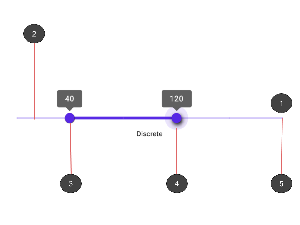
Both Slider and RangeSlider consist of five parts:
Value indicators that show labels for thumb values
A track that the thumbs slide across
Thumbs that indicate the position of the value
Overlays that display when the thumbs are pressed
Tick marks on the track when the slider is discrete
Note: This article refers to two different types of overlays:
-
The
OverlaySlidercomponent represents the component mentioned in the preceding image. -
Flutter’s
Overlayclass is used to ‘float’ widgets over all the other widgets shown on the following screen.
New default value indicator shape
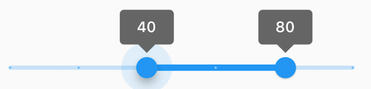
The biggest visual difference between the old slider and the new slider widgets is the default value indicators:
RectangularSliderValueIndicatorShape
for Slider and RectangularRangeSliderValueIndicatorShape
for RangeSlider. The indicators reflect the latest design changes from Material. The old indicator shape was an upside-down pear, and the new shape is more rectangular and looks like a speech bubble. The value indicator was updated for both
Slider and RangeSlider.
Value indicator paints on the overlay
The updated value indicator is now painted on the overlay. This means that the indicator is no longer restricted to the scope of the slider’s
MediaQuery and can be displayed over other widgets. This is expected because the indicator is only activated when dealing with the gesture detector, which means that it’s only shown when the user interacts with the slider. By integrating the
Overlay with the
CompositedTransformTarget,
CompositedTransformFollower, and
Layerlink widgets, the value indicator can display over other widgets. To learn more about this mechanism, see
How to float an overlay widget over a (possibly transformed) UI widget.
The following diagram shows how the Slider and RangeSlider widgets are made:
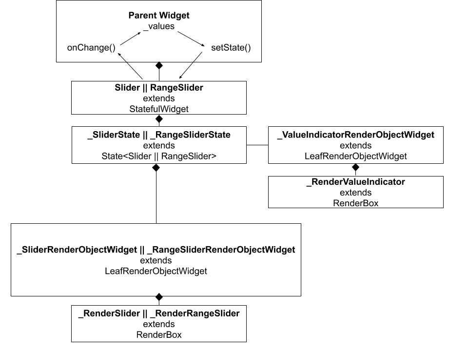
You may notice that we use a separate LeafRenderObjectWidget to paint the indicators on the overlay. This is because we need to paint on both the
Overlay class and the screen, which you can’t do from the same LeafRenderObjectWidget
widget.
Because we’re now painting the value indicator on the overlay, it’s no longer restricted to the scope of the
MediaQuery that contains the slider. The indicator is no longer clipped to that box, which means that the entire value indicator is displayed always.
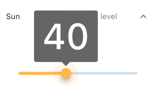
Note: This example was made with the textScaleFactor set to 4 for better demonstration.
The value indicator rectangle is shifted so that part of the indicator doesn’t go off screen. This improvement allows you to increase the number of digits within the indicator and increase the text scale factor of your application without worrying if the text exceeds the screen size. In the following image, the value indicator text scale is 4 and contains a 3-digit value, but the slider handles it with no problem.
double getHorizontalShift({

  RenderBox parentBox,

  Offset center,

  TextPainter labelPainter,

  double textScaleFactor,

  Size sizeWithOverflow,

  double scale,

}) {

  assert(!sizeWithOverflow.isEmpty);

  const double edgePadding = 8.0;

  final double rectangleWidth = _upperRectangleWidth(labelPainter, scale, textScaleFactor);

  /// Value indicator draws on the overlay, and by using the global Offset,

  /// we are making sure that we use the bounds of the Overlay instead of the Slider.

  final Offset globalCenter = parentBox.localToGlobal(center);

  // The rectangle must be shifted toward the center so that it minimizes the

  // chance of it rendering outside the bounds of the render box. If the shift

  // is negative, then the lobe is shifted from right to left. If the shift is

  // positive, then the lobe is shifted from left to right.

  final double overflowLeft = math.max(0, rectangleWidth / 2 —     globalCenter.dx + edgePadding);

  final double overflowRight = math.max(0, rectangleWidth / 2 — (sizeWithOverflow.width — globalCenter.dx — edgePadding));

  if (rectangleWidth < sizeWithOverflow.width) {

    return overflowLeft — overflowRight;

  } else if (overflowLeft — overflowRight > 0) {

    return overflowLeft — (edgePadding * textScaleFactor);

  } else {

    return -overflowRight + (edgePadding * textScaleFactor);

  }

}
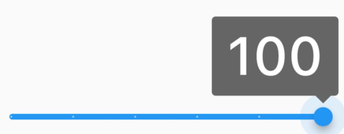
Note: This example was made with the textScaleFactor set to 4 for better demonstration.
Activated value indicator takes precedence
The RangeSlider value indicator was also updated so that the currently active indicator takes precedence over the resting indicator. This means that if the indicators overlap, then the active indicator ‘floats’ over the other one.
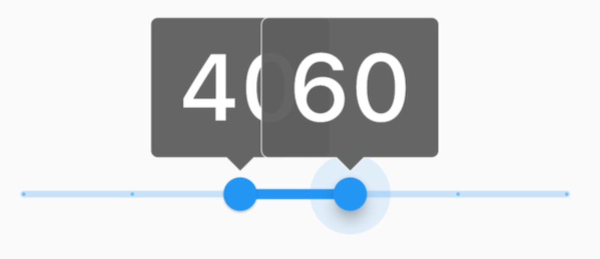
Note: This example was made with the textScaleFactor set to 4 for better demonstration.
Old value indicator updated
We kept the PaddleValueIndicator widget, and updated it to have better scalability and accessibility. The
PaddleValueIndicator widget is also printed on the Overlay like the RectangularSliderValueIndicatorShape. In the following example, you can see that both
Slider and RangeSlider are using the old value indicator.
If you want to continue using the old value indicator, then just wrap your Slider widget with
SliderTheme, and set the valueIndicatorShape property in SliderThemeData
to PaddleSliderValueIndicatorShape. The process is identical for RangeSlider. Wrap your
RangeSlider widget with SliderTheme, and set the rangeValueIndicatorShape
property in SliderThemeData to PaddleRangeSliderValueIndicatorShape.
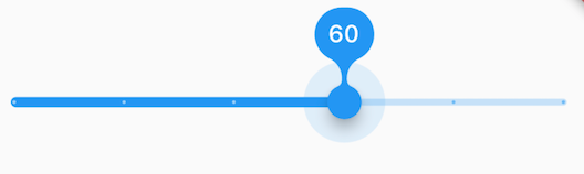
The active track is bigger than the inactive track
The other component shapes in Slider were also updated. The track shape was changed so that the active part of the track is bigger than the inactive part of the track. This means that if your application uses a left-to-right language, then the left part of the track is bigger than the right. If your application uses a right-to-left language, then the right part of the track is bigger than the left. For
RangeSlider, the active track is the portion of the track between the two thumbs.


Tick mark component
The tick mark size and positioning changed. The tick marks are now part of the track component instead of extending the end of the track. There is also padding on the tick mark, so it appears within the track component. The size of the tick mark now has a radius of 1.

Thumb component has a shadow
When the thumb slider component is activated, there is now a Shadow that appears on the
Overlay.

Closing remarks
You can try these changes by switching to Flutter version 1.18.0–9.0. This version is available only on the master branch during the release of this article. You can switch to the master branch by running
flutter channel master and then flutter upgrade.
Learn more about the development of the RangeSlider in Material RangeSlider in Flutter.
About the author: Jose recently graduated from university and now works on Material, a design system that helps teams build high-quality digital experiences. Jose’s team maintains the Flutter material library. To learn more, visit his Jose’s pages on GitHub, LinkedIn, YouTube, and Instagram.
More from Flutter

Flutter Q2 survey
Just a reminder! Please take the Flutter Q2 survey! The survey closes at the end of day on Friday, June 19th.


Announcing our new Dart and Flutter Getting Started experience
When I joined the Dash DevRel team, my manager gave me an onboarding doc which started like this: “Your new job in one sentence: Improve…